The Challenge of Designing a Watch
Signature designs establish brand identity and recall. But if watchmakers don�t reinterpret enough, they run the risk of making the brand look jaded
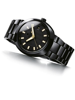
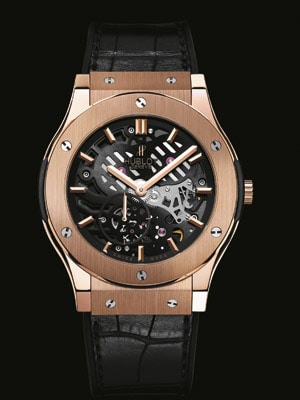
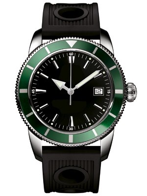
Quick! Can you guess the watch brands on this page? All of them are current models from respected and premium Swiss brands. Of course, we’ve taken the liberty to black out the brand names.
Don’t worry about the answers, we’ll come back to them in a while. What should be more interesting is the thought process behind how you arrived at the answers (or gave up).
In the first set you’d probably search your visual memory for references to the obviously retro-style barrel (or ‘tonneau’) case shapes, the extensive use of stainless steel and uncomplicated dials. For the second, you’d quickly figure from the oversized rotating bezels, strong hour markers and arrow-shaped hour hands that the common link was a diving legacy. And the last set would appear relatively modern, even avant-garde, judging from the use of materials like carbon fibre and rubber, the deliberate use of primary colours, and, of course, rose-gold.
If you did arrive at some guesses, it’s probably because your brain thought it ‘recognised’ some of these as signature designs.
The world of watches is a crowded one. Even if we discount the low-end (roughly 80-90 percent) of the global watch market, there would still be a few hundred brands competing for the attention of customers around the world. Within price segments most competing brands are able to offer the same set of ‘features’ (or ‘complications’).
So when it comes to carving an identity and emotional connect in a customer’s mind, it’s often design that must do the trick.
Heritage or Legacy?
If there is one thing that Swiss watch brands place above all else, it is ‘heritage’. Almost every brand worth its salt will claim a history that dates back to the early 1800s. Blancpain, for instance, claims to have been around since 1735. What’s often not disclosed is that it went bankrupt and its modern history starts only from 1983 when Jean-Claude Biver bought the brand and resurrected it, before selling it off to the Swatch Group in 1992. But even if one discounts much of that history as polished marketing, each brand still has a catalogue of a few score watch models spread over decades.

Though these catalogues are highly sought-after assets—they can be easily modified for current tastes and reissued—at times they could be seen as liabilities too. Why?
Because an indiscriminate range of models dilutes a brand’s visual identity, making it unable to occupy visual niches in the customers’ minds.
The best counter-example of this is the world’s largest independent brand, Rolex. Unlike its much older peers, Rolex began life only in the early 1900s. And of the large watch brands it has arguably the least number of unique models, so much so that it can be hard to tell a few-decades-old Rolex from a current one. So, chances are, even a lay watch buyer will be able to instantly recognise a Rolex.
Unfortunately there’s a flip side to that. Many younger and trendier watch buyers will find Rolex’s designs too conservative and predictable.
The sweet spot that every brand wants to occupy is somewhere in the middle—where a few key signature designs are firmly established in the minds of customers, each of which is flexible enough to be reinterpreted with contemporary trends.
The devil, of course, lies in the reinterpretations or extensions. Diverge too much from the original and you’ve lost the identity you were seeking to build; too little, and customers will think your collection jaded and antiquated.
Some brands are very structured and precise about it, ensuring there’s a very clear visual thread running across their collections, for instance Rolex, Tag Heuer or Omega.

Others, led arguably by Hublot (established only in 1980, and one of the most distinctive and sought after watches already), are much more imaginative about the way they design new models from old. For instance, the Extra Thin Classic Fusion is almost not a Hublot, in the sense that it is very slim (2.9 mm), has no complications other than the time and no colours other than red gold or black. Yet strangely, it works and is instantly recognisable as a Hublot.
Movado’s Red Label Planisphere retains the elegance and simplicity of its “Museum dial” (the single dot at 12 o’clock) but adds two meticulously rendered photos of the earth and moon from space on the dial and circular date and moonphase indicators.
Outwardly, the Bell & Ross (another young brand, born in 1992) BR 01 Horizon stays true to the brand’s signature large, dual-tone watches that look as though removed from an aircraft’s cockpit, but its clever and minimal use of an aircraft’s altitude indicator makes it an instant graphic design winner.
Finally, the Rado Specchio extends Rado’s leadership in materials with the introduction of rose-gold Ceramos (its proprietary ceramic-metal composite) in a tonneau-shaped case and minimalist dial.
Oh yeah, the watches at the beginning of this article. In order of appearance, the first set was the Rado D Star and the Movado Datron; the second set was the Breitling Superocean Heritage 42, Tudor Pelagos and Omega Planet Ocean; and the final set, the Hublot King Power India, Blancpain L-evolution Chronographe Flyback à Rattrapante, and Concord C1 Chronograph.


