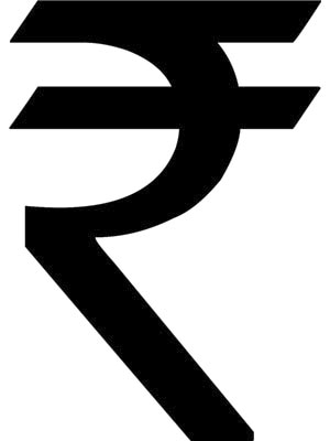
India’s New Rupee Symbol
What makes the design work is the horizontal stroke which runs parallel to the top bar, which has been interpreted as an ‘equals to’ sign
The Republic of India is unique in its extraordinary diversity of language and scripts. As many as seventeen different languages are represented on its Rupee note. How does one then reduce this diversity to a single symbol of our currency?
The chosen symbol is based on the Devanagari script using the letter Ra to serve as a mnemonic for the word Rupee. This is a fairly obvious idea — perhaps the first thing one would think of. It is hardly a surprise, then, that a large number of the thousands of entries submitted to the competition based their designs on the Devanagari Ra.
Of all the Indian scripts, the Devanagari is the most widely used. Besides Hindi, which is the most widely spoken language in India, variants of Devanagari are used across all the scripts in the North, including Gurmukhi, Marathi, Bengali, Assamese, etc. While the scripts of southern languages do not reflect the Devanagari infuence, it is acceptable in the south because of the legacy of Sanskrit.
If the mark is to have a semantic connect across the country, Devanagari is the only sensible choice. Again, the choice of the Ra character is an obvious one as it provides the phonetic connect with Ra for Rupee (like A for Apple). No other character could have been considered (for example P for Paisa, which has more or less lost its relevance, cannot be considered as a symbol for the Rupee).
Serendipitously, the Devanagari Ra also bears a resemblance to the letter R of the Latin alphabet, as it looks like a stylised R without the vertical stroke.
What makes the design work is the horizontal stroke which runs parallel to the top bar, which has been interpreted as an ‘equals to’ sign. This is what brings the otherwise nondescript Ra into the world of currency symbols.
This small intervention creates a formal connect with the visual vocabulary of other symbols such as the dollar, euro, pound and yen, all of which have strokes added on to traditional letterforms. Its resemblance to these universally recognised currency symbols makes this one credible, guaranteeing its entry to a club where the members have to look like they belong, where it is not appropriate for them to be disruptive.

Five designs that were short-listed by the jury and sent to the Cabinet for its approval
For all these reasons, the chosen mark is appropriate to represent the rupee. However the process by which it was chosen is mystifying. The final logo was not one of the five designs that were short-listed by the jury and sent to the Cabinet for its approval. So where did it come from, and how did it become a contender after the short list was published? As in most cases of selection initiated by the Government, the process is unclear.
However, in this instance, the final design is a great improvement on the designs in the short list; so perhaps, just this once, the end justifies the means.
Sujata Keshavan is MD & Executive Creative Director, Ray+Keshavan
(This story appears in the 30 November, -0001 issue of Forbes India. To visit our Archives, click here.)


